

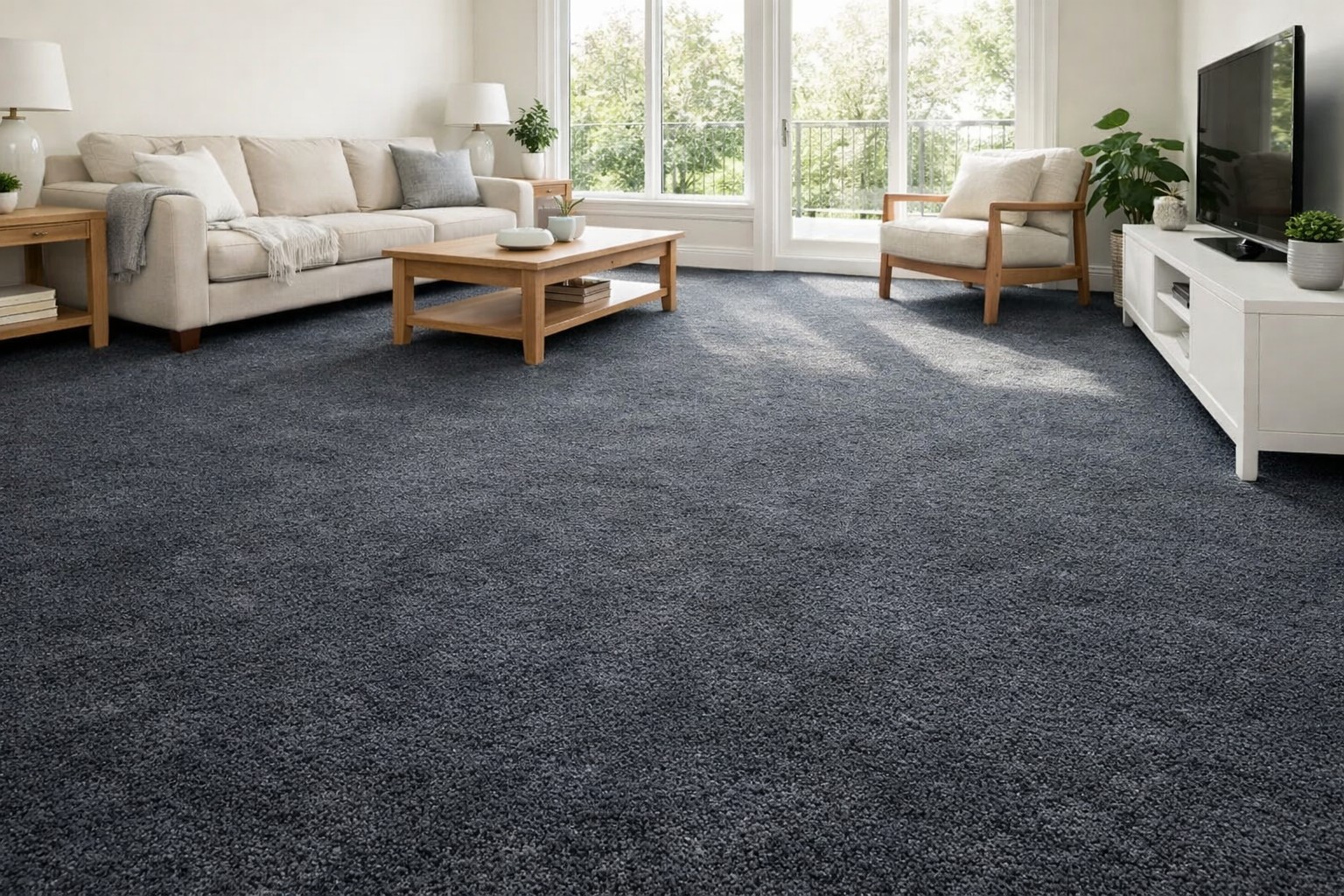
There's a rule that gets repeated a lot in home design circles: bright rooms need light floors. Keep it pale. Keep it airy. Don't weigh the room down. It sounds logical until you walk into a sun-drenched living room in Barrington Hills with a deep charcoal carpet and realize the whole space feels anchored, sophisticated, and more alive than any room with a beige floor you've ever stepped into.
The truth is, dark carpet and bright rooms aren't opposites. When the pairing is done right, they bring out the best in each other. The light bouncing off your walls has to land somewhere, and a rich, deeply colored carpet gives it a beautiful place to rest. Here's what's actually working in homes across Algonquin, Schaumburg, and McHenry right now, and why the rule was never really a rule at all.
Why the 'light floors only' rule deserves a second look
Light doesn't disappear, it settles
When a room has large windows, south-facing exposure, or high ceilings with plenty of reflected light, the last thing it typically needs is more brightness at floor level. What it needs is balance. A dark carpet acts like the bass note in a piece of music: it gives everything above it something to contrast against, which actually makes the lighter elements of the room feel more intentional and refined.
Think about the rooms you remember most. Chances are they weren't uniformly pale from floor to ceiling. They had depth. A dark carpet in a bright room creates that depth without a single piece of furniture needing to change.
The fear of 'closing in' a room is mostly unfounded
People worry that a dark floor will shrink a room visually. In practice, it's the opposite. Dark flooring draws the eye downward and outward toward the perimeter of the room, which makes the floor plane feel larger, not smaller. This is especially true in open-plan homes in Huntley and Carpentersville where the living and dining spaces flow into each other. A single consistent dark carpet across the whole floor reads as expansive, not heavy.
The colors that earn their place in a bright room
Charcoal and slate grays
These are the workhorses of the dark carpet world, and for good reason. A true charcoal is warm enough to feel comfortable underfoot but cool enough to play beautifully against white trim, light walls, and the kind of natural wood furniture that's everywhere in homes across Palatine and Ridgefield right now. It reads as modern without feeling cold, and it pairs effortlessly with almost every color on the wall.
Slate gray, which carries a slight blue or green undertone depending on the light, works particularly well in rooms with north or east-facing windows where the daylight has a cooler quality. The carpet and the light almost match each other's temperature, which creates a calm, cohesive feeling that's hard to achieve with warmer tones.
Deep navy and midnight blue
Blue carpet used to feel risky. Now it's one of the most requested colors in rooms that get a lot of natural light, and it makes complete sense once you see it in person. Navy absorbs light without deadening a room. It adds color without pattern, personality without noise. In a bright room with white or cream walls, a navy carpet becomes the quiet statement piece that pulls the whole space together.
Homeowners in Elgin and Lakewood have been gravitating toward navy in their studies and primary bedrooms, where the combination of morning light and a deep blue floor creates something that honestly feels like a boutique hotel room.
Forest green and olive tones
Green carpet has had a serious moment in interior design, and the versions that work in light rooms aren't the jewel-bright greens of decades past. They're muted, earthy, slightly dusty tones that read as natural and grounded. Forest green in a room with large windows and houseplants feels intentional and organic. Olive or sage-toned carpet in a sun-filled dining room or bedroom adds a softness that warmer neutrals simply can't match.
Warm chocolate and deep espresso browns
Browns fell out of fashion for a while, but the rich, saturated versions are making a strong comeback in modern homes throughout McHenry County. The key distinction here is depth: a washed-out or greige-toned brown can feel flat, but a true espresso or mahogany-toned carpet in a bright room with warm lighting and natural wood accents feels genuinely luxurious. It brings the outside in, in the best possible way.
Making it work: what to consider before you commit
Pile height and texture change everything
A dark carpet in a low, tight loop pile reads very differently from the same color in a plush cut pile. Loop constructions reflect less light and tend to feel more casual and graphic. Cut pile, especially a dense frieze or textured saxony, has movement and dimension that softens the darkness and keeps the room from feeling flat. For bright rooms where you want drama without heaviness, a mid-to-high cut pile in a dark tone is almost always the right call.
The undertone has to talk to the room
Every dark color has an undertone, and in a brightly lit room that undertone becomes visible quickly. A charcoal with a purple undertone behaves completely differently from a charcoal with a warm brown base. Before committing to a color, look at it in the actual room at different times of day. Morning light, afternoon sun, and evening lamp light will each show you something different, and all three matter.
This is exactly why our flooring experts recommend using the flooring inspiration gallery as a starting point, then getting samples into your home so you can see the interaction between your specific light, your walls, and the carpet before making any decisions.
Contrast is a design tool, not a problem to solve
The instinct when pairing dark floors with bright rooms is to soften the contrast. Resist it. The contrast is what makes the room work. Light walls, dark floor, medium-toned furniture in the middle: this is a tried and proven formula that designers have used for decades in some of the most beautiful residential interiors on record. Embrace the contrast and let it do the heavy lifting for you.
Ready to see what dark carpet looks like in your home?
At Area Flooring & Tile, we're a family-run flooring company based in Crystal Lake and proud to serve homeowners throughout Palatine, Schaumburg, Algonquin, Huntley, McHenry, Elgin, Barrington Hills, and beyond. Our flooring experts will help you find the right color, texture, and pile for your specific space, and our shop-at-home service means we can bring samples directly to your room so you see exactly how they perform in your light before you decide. Call us today!


